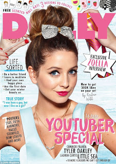
 This magazine has five main colours, pink, blue, white, black and yellow. Of these four, pink and blue are the most attention grabbing colours. Pink can be connotated with lipstick, flowers and femininity, and the shade of pink that Dolly magazine has used is bubblegum pink so there’s also the resemblance to bubble gum. Blue can be connotated with the ocean and sky, sapphires and various birds. I reckon that Dolly's target audience are young, impressionable, teens. The shades of blue and pink are very light and sweet like confectionary so I think the hues appeal to the audience as they resemble gummy bears and sweets like that, which teenagers and children have a tendency to like.
The main colours on this cover is black, red, and white. Black is connotated with dangerous things like death and smoke. Paradoxly, white is connotated with pure things like heaven, clouds, and light. When black and white are put together they create a classy facade and they look minimal and sophisticated yet stylish, however I think this magazine is playing with that concept. Avril Lavigne's makeup and clothing is messy and gothic so it doesn't particularly seem classy to me. Then, they add red which is connotated with risky and dangerous things, as well as sexual things. Red is seen as risky because of driving-danger signs and fire, but it also seen as sexy because of lipstick and lingerie. Normally when magazines have a red-white-black theme, they are using the lustful representation of red however here I think they are using both implications. The red seems sort of risky because of Lavigne's edgy eyeshadow and bralet, but it also seems sexy because words like "sex", "balls", and "bad girl" are highlighted in red, and these are words with provocative connotations.
The main colours in this cover are black, blue, pink, white, and flesh (if that is a colour…). Apart from black, all the colours are pastel shades and light hues can be connotated with spring, sweets and flowers, and so I think the main cover image can be perceived as fruity and fresh. As I mentioned when analysing the previous cover, black is connotated with dangerous things but I think that because W has used such an elegant, chic, and vintage font and also because there are so many other light and soft colours, here the black doesn't seem dangerous and instead it just seems classic or modish.
If I was to produce a cover for an indie-rock themed magazine this would be my colour palette. I've chosen them because I've seen many indie and grunge fashion and musical icons supporting these colours, such as popular Instagram and web blogger Le-Happy who has been supporting red hair for a matter of years or the popular yellow smiley-face emblem for the band, Nirvana. My favourite thing surrounding grunge style is that bold and bright colours are taken and dulled down so that they don't grab lots of attention yet easily compliment each other, so when making this palette I chose a vibrant red, yellow, and green, and then kept darkening the original colour. I have chosen a charcoal shade appose to black which is the pinnacle dark colour because although black is technically the absence of colour, I think that it's still to bold and captivating and I wanted something mellow.
I designed this cover based around this colour palette. I chose to make the background charcoal because this will make the other colours seem bright and pop off, whilst still allowing them to look mellow. I made the tagline and issue date reds because red accompanies yellow better than green. I chose to make the masterhead yellow because it's the brightest and happiest colour, so it refines the cover from looking obsessively dull and gothic. I made the coverlines green as they were the final colours in my palette to use.
This colour scheme was prompted by a fashion and beauty magazine for women, with emphasis moreso on beauty than fashion. I chose a range of pink tones because pink is stereotypically the colour favoured by women and also pink is a common colour for makeup with pink blushes and lipsticks being very common.
This is another cover I designed based off this palette: Because the shades are monochromatic, my choices were unplanned and more so experimental.


No comments:
Post a Comment